Strategising Data for a Successful Website Design
Data is a powerful tool in shaping website strategy and design. By analysing it, we gain insights into user behaviour, search habits, attention spans, and intentions. Our 24 years of sector experience gives us a unique perspective on what works and what doesn’t. Olly, our Senior Designer, shares his take on how data can influence website design.
Whenever we approach a web design project, data is at the core of our decision-making process.
Our analytics specialists gather data from multiple sources, including user insights, analytics, and search data, to develop a detailed understanding of your audience and the different segments.
This then guides key decisions, from sitemap creation to structuring information architecture and making stylistic choices.
The Role of Data in Strategy
We work closely with clients to define strategy, establish key performance indicators, and clarify what success looks like. When data is available, it informs the development of sitemaps, planned user journeys, and wireframes.
Data provides valuable insights into user interests, revealing where they visit most frequently, their paths to get there, and their level of engagement.
For example, if data shows that users are primarily seeking a certain page, is it easy for them to find it, or is it buried within a lower site level?
During our work with green recruitment websites, we found that when we moved a link to a jobs board from the third level to the second level of the sitemap and placed it in the header, users accessing that page from the homepage increased 19%.
Conversely, are users spending time on low-priority pages? Is the website leading them to dead ends instead of guiding them back toward conversion?
Structuring a website to direct users to higher-value pages is essential for enhancing their experience and meeting business goals.
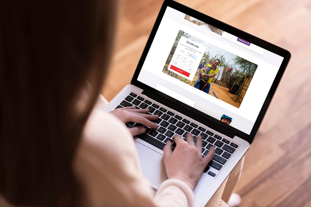
During the strategy phase of the CBM UK redesign, we decided to integrate the donation process directly within content sections. This approach allowed donation-focused pages to provide users with the necessary tools on the same page, rather than redirecting them to another page.
This isn’t a one-time process. As user behaviours evolve, ongoing data collection and testing ensure that the website continues to meet user expectations and business goals.
Data-driven design is a research-backed approach that promotes continuous iteration, which drives outcomes such as increased conversions, lower bounce rates, or simply boosted user satisfaction.
We engaged with multiple specialists to analyse strategic insights for Mullis & Peake to make user-centric enhancements that resulted in a 259% increase in organic visibility, a 35% increase in traffic, and a 21% increase in engagement rate.
The Information Architecture
Hierarchy and order of information is crucial in website design.
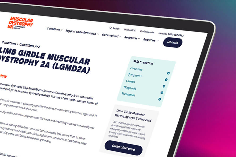
When so few users explore beneath the ‘fold’ (the point at which content requires scrolling to become visible), it’s important to provide users with the most valuable information where they are most likely to find it.
Data provides insights into where users are likely to scroll and where they focus to accomplish their tasks.
For example, users navigating a key journey typically look for the primary link above the fold, often within the hero section or the first content area of a page.
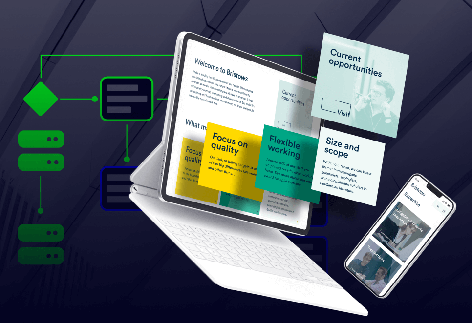
We used conversion rate optimisation when working with Bristows to generate a 16% lead completion rate from advertising on LinkedIn, well above the 5-10% average.
We distinguish primary and secondary links through styling and positioning, ensuring secondary links are placed below the primary ones for clarity.
When testing three education websites, we found that 25% more users reached the second page in a funnel when using a vibrant primary button class as opposed to a secondary button class that was less prominent.
On content-heavy pages, such as university course pages, we equip users with tools to navigate efficiently.
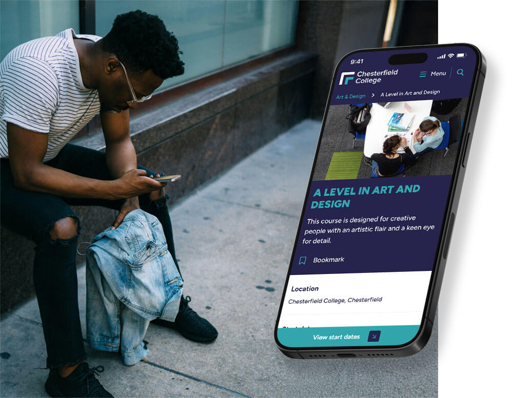
We found that users were three times more likely to scroll beyond half-way on course pages when anchor points were made available.
We limit page length by clustering secondary information into a single section using content tabbers or accordions. This can also reduce the number of pages on a website.
By using content tabbers on longer pages, we’ve found that education websites experience increased dwell time.
Our mobile-first design philosophy emphasises the linear nature of mobile experiences. Consequently, the horizontal order of information on desktop views is carefully structured to maintain clarity.
Heading classes are designed with SEO in mind, aligning with how search algorithms interpret content and user intent.
We support these approaches with proven methods, such as limiting cognitive load and chunking.
Cognitive load refers to the mental effort required to process information, which can overwhelm us if too much is presented at once. Chunking helps by breaking information into smaller, manageable pieces, making it easier to understand and remember.
When we design an interface, we balance the tools we provide to users with cognitive load, so that a website is intuitive and easy to use.
As Daria Krasovskaya wrote for UXTweak, “The more choices users have, the longer it takes for them to make a decision. Too many choices lead to decision paralysis and as a result, a frustrating experience.”
We also look for opportunities to chunk information. This leads us to structure menus a certain way, or shorten content into bitesize paragraphs.
Data’s Impact on Stylistic Choices
Data plays a crucial role in shaping stylistic choices, guiding visual hierarchy and aesthetics to enhance user engagement.
Heatmaps and eye-tracking data help optimise the placement of attention-grabbing elements like call-to-action buttons, as well as refine details such as colour contrast and font sizes.
How we style sections often works in tandem with information architecture. Areas of greater contrast or vibrancy often carry more visual weight, and we know they work well with sections containing a primary link. These techniques can subtly guide users toward a certain outcome.
Call-to-actions are a crucial element on a website, often funnelling users toward conversion. Their appearance must be eye-catching and engaging, but that transcends choosing a colour.
Our team works hard to establish a clear focus style for better accessibility, and we use arrows so that buttons are colour-independent for users with sight deficiency.
By tracking micro-conversions, we can see that these adjustments boost engagement from all users. We evaluate the effectiveness of these choices and make iterative improvements to ensure that design elements align with user behaviour and expectations.
We also see a boost in engagement when we use an icon with a link that indicates what happens on interaction, such as whether a button will open a modal or point off-site. We avoid interactive elements that can present as a ‘Norman door’, something that visually indicates one behaviour but performs another.
Insights into user demographics and preferences allow for personalised styling, guiding decisions on features like dark mode versus light mode, font sizes, and the number of tools or interactive elements to include.
This is an insight-led approach ensuring designs are tailored to the unique needs of different sectors.
For instance, the compassionate and accessible design required for hospice websites contrasts with the sleek, functional interfaces needed for professional services portals.
Balancing Data and Creativity
We view data as a valuable tool for understanding user behaviour and expectations, rather than a definitive guide for decision-making.
While it provides insights, we’re mindful of the risks of over-reliance. Users often approach websites with unrealistic expectations or ineffective habits, so our design strategy balances meeting these expectations (to sustain engagement) with guiding users toward outcomes that deliver value to them while driving conversions for the website.
To achieve this balance, we leverage data as a starting point while allowing creativity to shape intuitive, human-centred designs.
Data highlights trends, pain points, and opportunities, but it’s the creative process that brings these insights to life.
Conclusion
We aren’t a “set it and forget it” agency. We know that websites and user behaviours shift like the tide, and we partner with our clients to ensure their site remains dynamic, responsive, and aligned with user needs.
We have plans available to our clients that integrate feedback loops, whereby we collect data, interpret it, perform iterative improvements, and help all our clients benefit from the knowledge we gain.
By engaging with Itineris to design your website, you benefit from an agency that has compiled an unparalleled knowledge and understanding of websites within your sector, and we use those learnings to enhance the performance of your website.
Get in touch with us today to discover how we can help you learn about your users, and tailor your website to become successful.